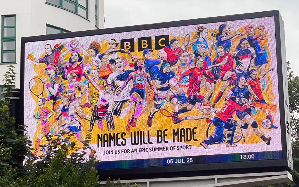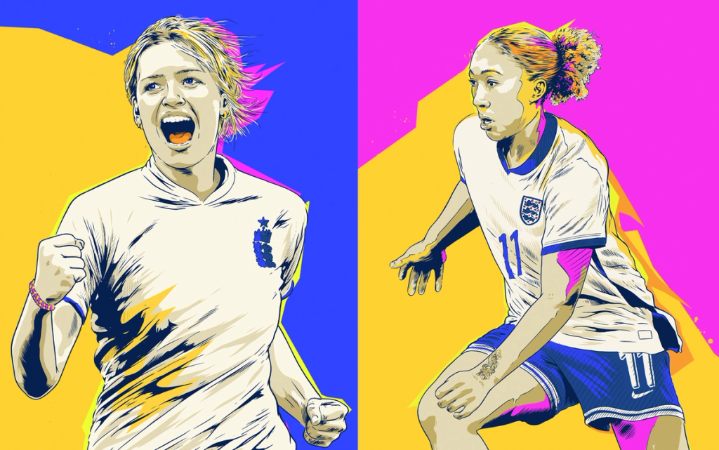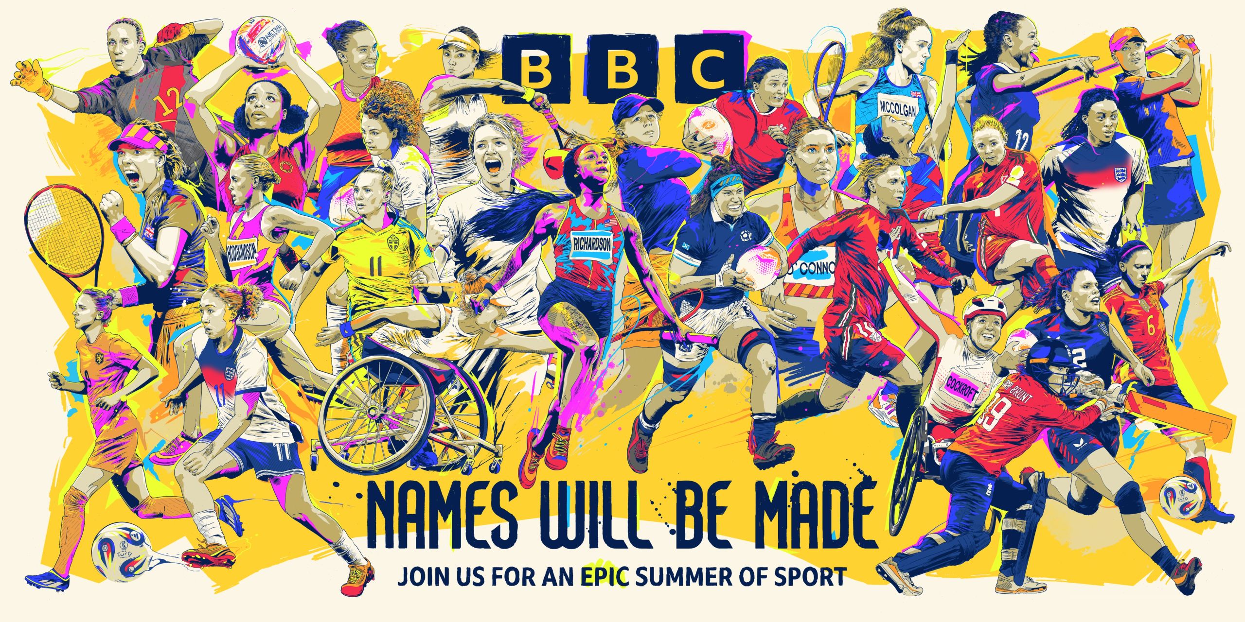

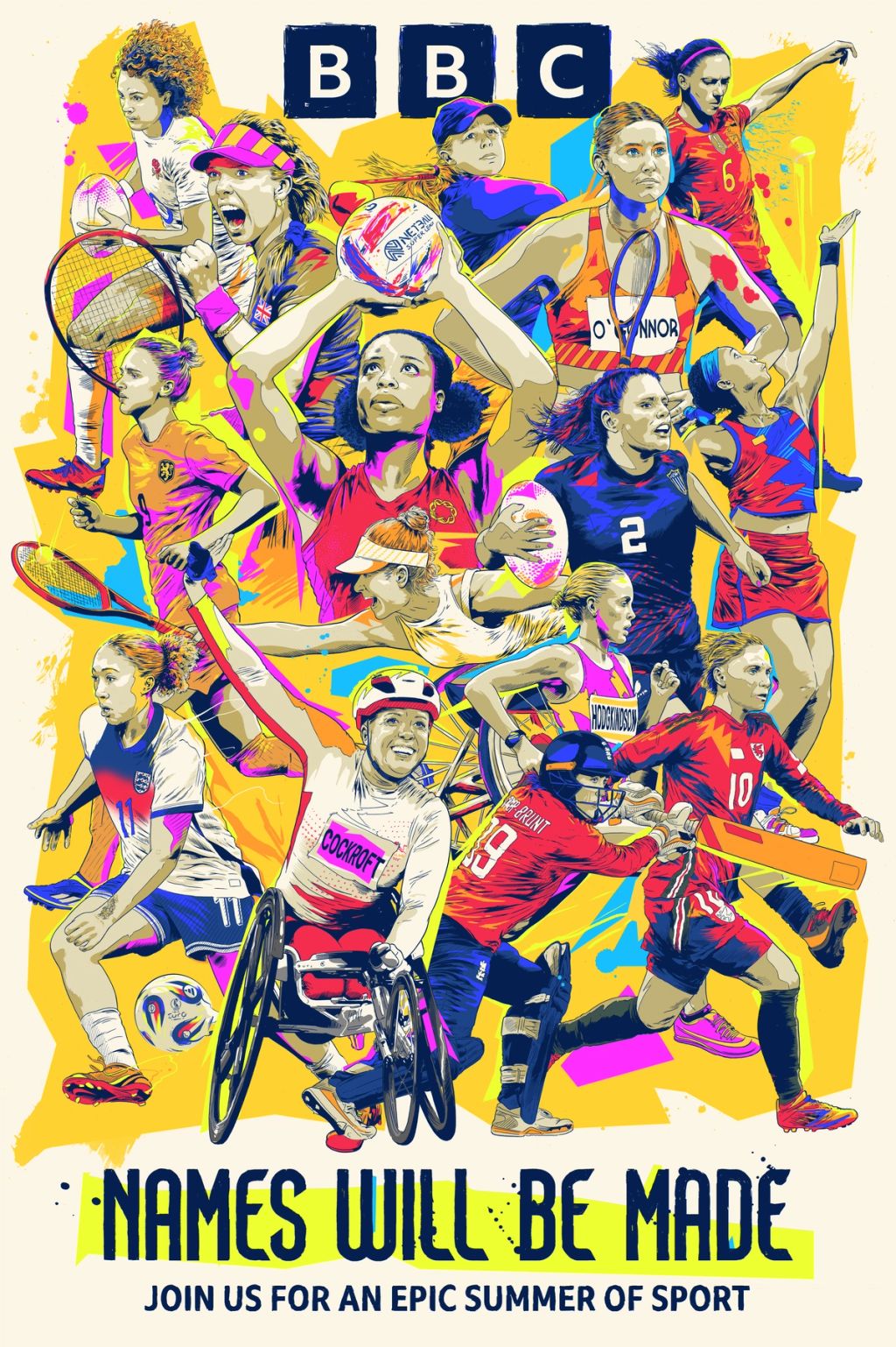
It’s no secret that Tim McDonagh can handle a challenge. Meticulously hand-inked depictions of recognisable faces and layered compositions are his bread and butter. So, when the team at BBC Creative approached him with a bold brief to illustrate 40 women athletes for their ‘Names Will Be Made’ campaign, there was (as usual) no hesitation.
The ask was ambitious: no single reference photos, just moving footage to work from, a tight four-week deadline, and a requirement to accurately depict athletes from across a wide range of disciplines, each in their national colours and supplied in four different compositions and orientations. Easy.
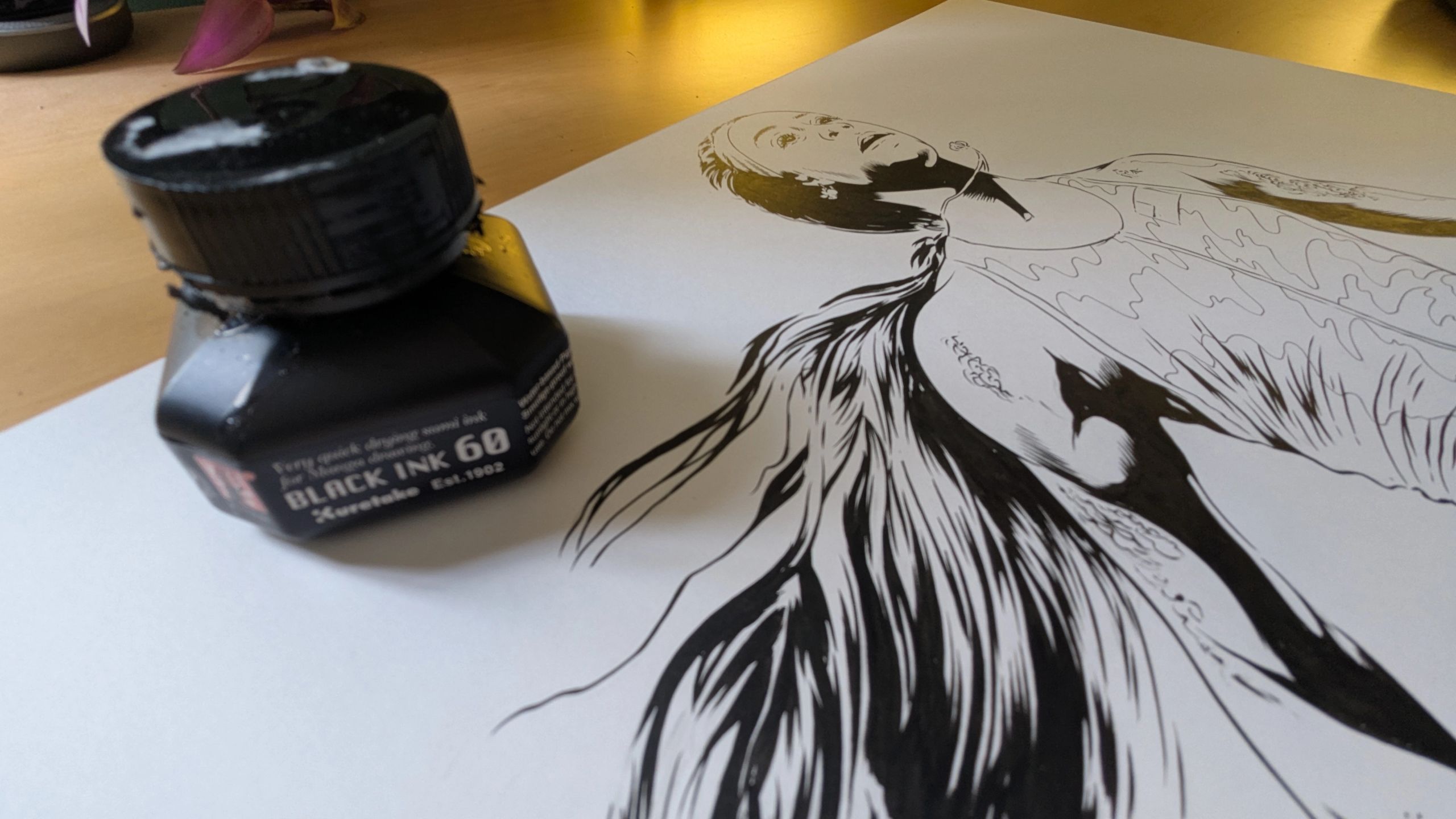
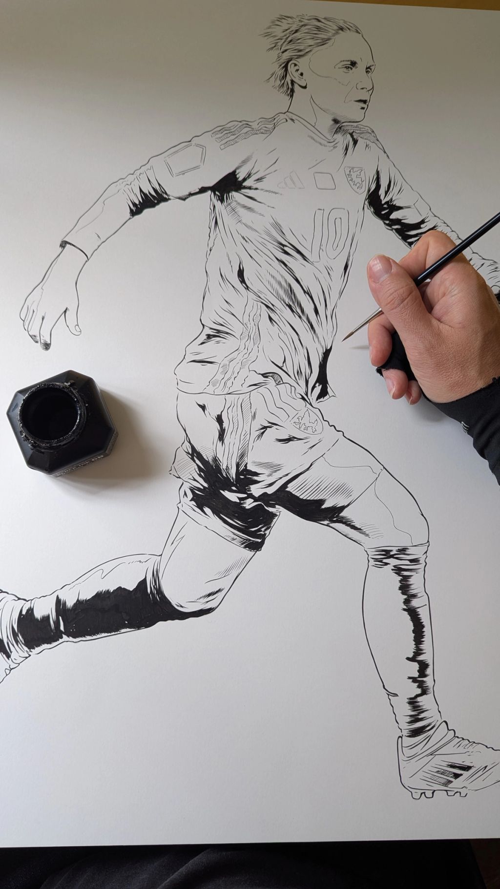
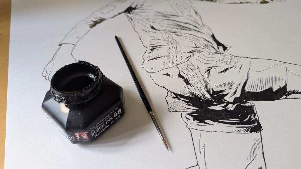
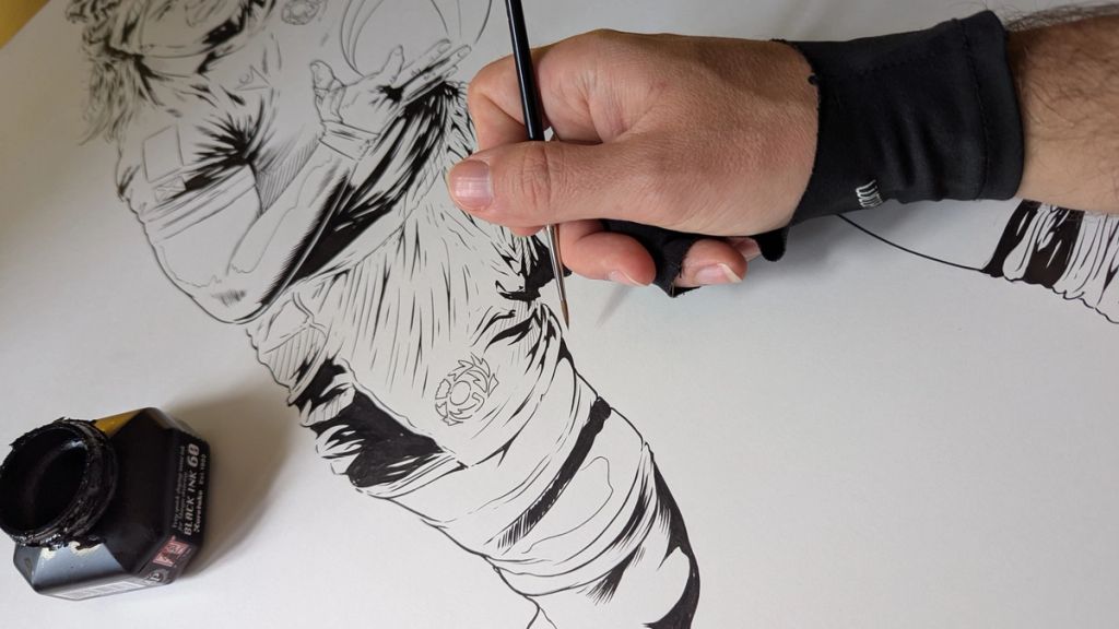
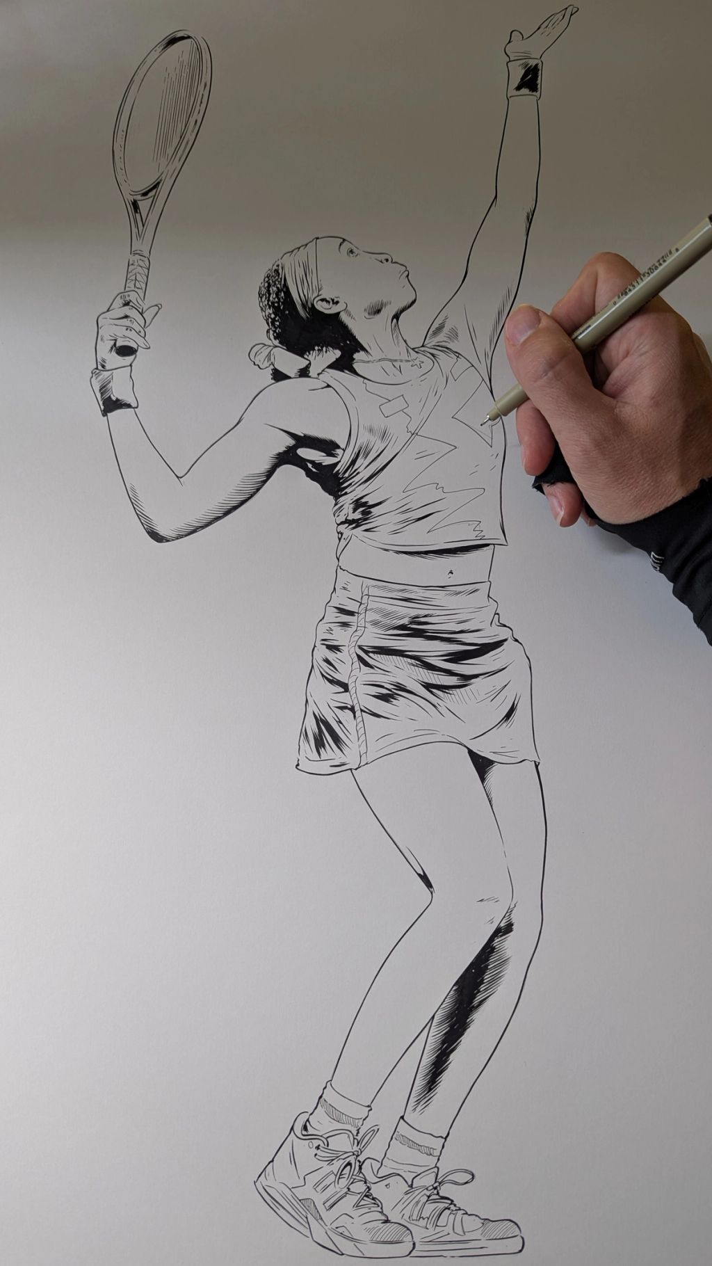
He got to work, inking each athlete by hand (yes, by hand - not digitally), before settling on a carefully considered colour palette that stayed true to each team’s identity. In true Tim style, even the BBC logo was inked, to ensure everything sat together as one cohesive piece.
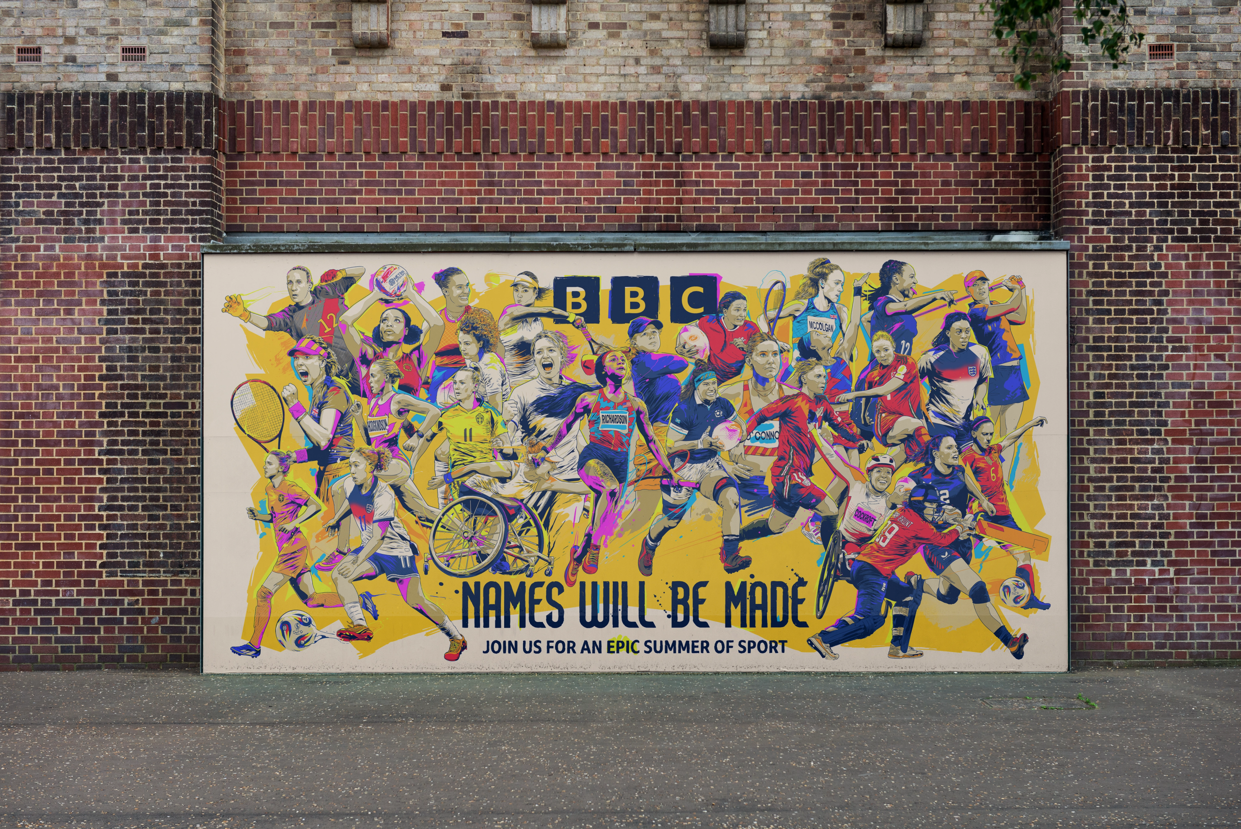
The final result is a riot of colour and energy. Bold, celebratory, and full of movement, these illustrations made their way onto 48-sheet digital billboards across London, championing the athletes and the spirit of the ad-campaign.
A huge thanks to the brilliant team at BBC Creative for their vision, support and collaboration. Just as the last strokes of ink dried, we caught up with Tim to hear more about how it all came together.
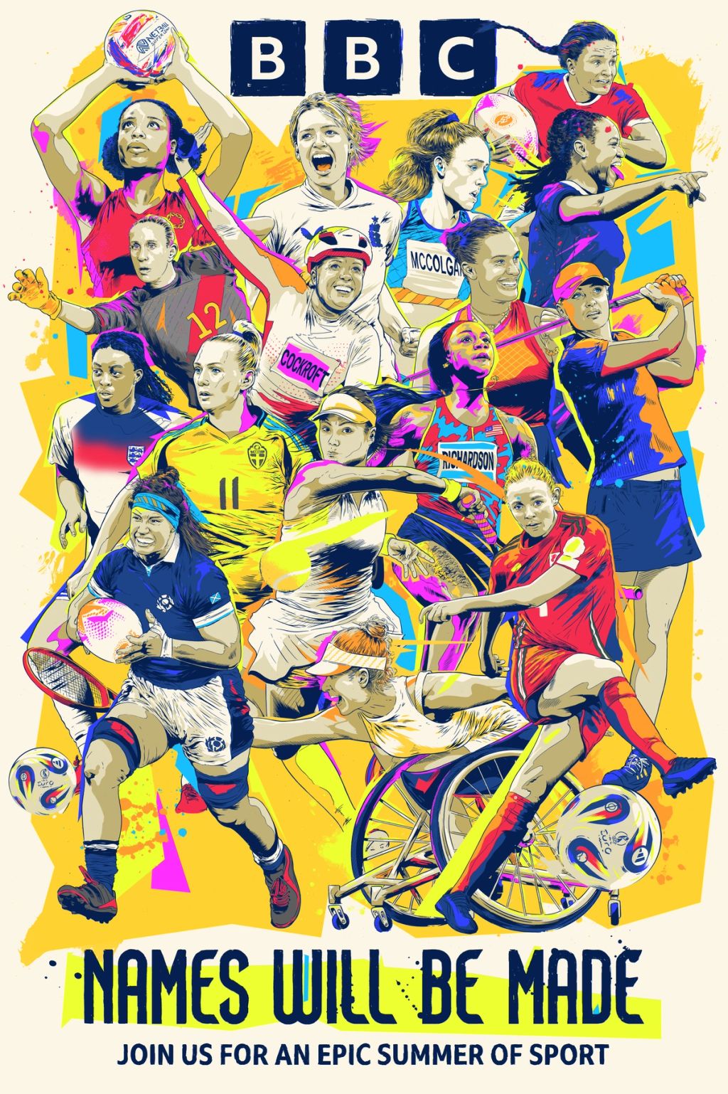


We were amazed by the scale of each illustration - each athlete rendered at A2 size! Does working at such a large scale influence your process or the level of detail you're able to achieve?
Yeah it does influence how I go about the process, it just gives me more options really of how much detail I can fit it in the areas where it’s important. Although I’ll strip some details away, it gives me more flexibility to get some more detail in on things like faces/hair and even nice little details like boot laces then you’re forced to strip back when working smaller.
Your linework is so distinctive - have you ever tried replicating it digitally, or do you prefer traditional tools?
I’ve tried on a few occasions to replicate it but I’ve never been too successful at it. At this point I think I’m going to stick with the brushes as it’s the part of the process I also enjoy the most. I think what it gives the illustration is lots of small imperfections that hopefully give it a bit of charm. Sometimes you can look at a line or brush stroke and unconsciously or not tell it’s come from a real brush I think, even though those lines are getting ever more blurred.
With ink being such a permanent medium, how do you handle revisions or unexpected changes once a piece is complete?
Over the years I’ve developed a few methods depending on the job really. For this one as there were so many athletes I thought it would be wise to draw each one separately so there was freedom to move things around and play with the composition a little as we went along. When it comes to actual revisions of the drawings though, I try and send over a pretty tight sketch to the client has a good idea of what to expect but if there are revisions after then sometimes I can come up with a digital fix but more times than not it’s the classic redraw.
Your compositions are always so considered, especially in busy, detail-rich scenes. How do you approach planning the layout to ensure everything feels balanced and cohesive?
I think over time you start to develop a bit of an eye and feel for it, it’s just about balance even in the chaos really. With something like this I wanted to try and make sure there was plenty of energy that didn’t get lost so to make sure that things like hands and feet were fairly visible and things didn’t get to crowded. Because they were all draw separately this made the whole process easier and I could play around a fair bit with some different compositions but had they all been one drawing there would’ve been some more careful planning from the start!
Colour seems to be a real signature in your work - bold, yet always carefully chosen. What’s your process when it comes to selecting a palette?
Sometimes it’s completely down to me and other times the client has certain colours in mind they’d like to stick to for a variety of reasons. In this case the BBC had a certain yellow they were using throughout a lot of their summer campaign so that had to be considered and we had to make sure the jerseys of the athletes were representative of the actual colours. So just from those parameters you already had something of a colour palette really. I added some pinks and brighter colours to give it a bit of summer punchiness too! Usually it’s project dependant but my preference is big bold lines, big bold colours.
You’ve tackled such a wide range of subjects with your work. Is there a particular topic or theme you haven’t illustrated yet but would love to explore?
I think I’d probably like to lean into the analogue and psychedelic a little more as it kind of lends itself to my favourite ways of working but in truth part of what makes my job so enjoyable is the large variety of projects that come in. I’d quite like to see how my chaotic business would fair in a more ordered environment like a repeating pattern or something in that vein so if there’s anyone commissioning wallpaper out there then I’m all ears!
