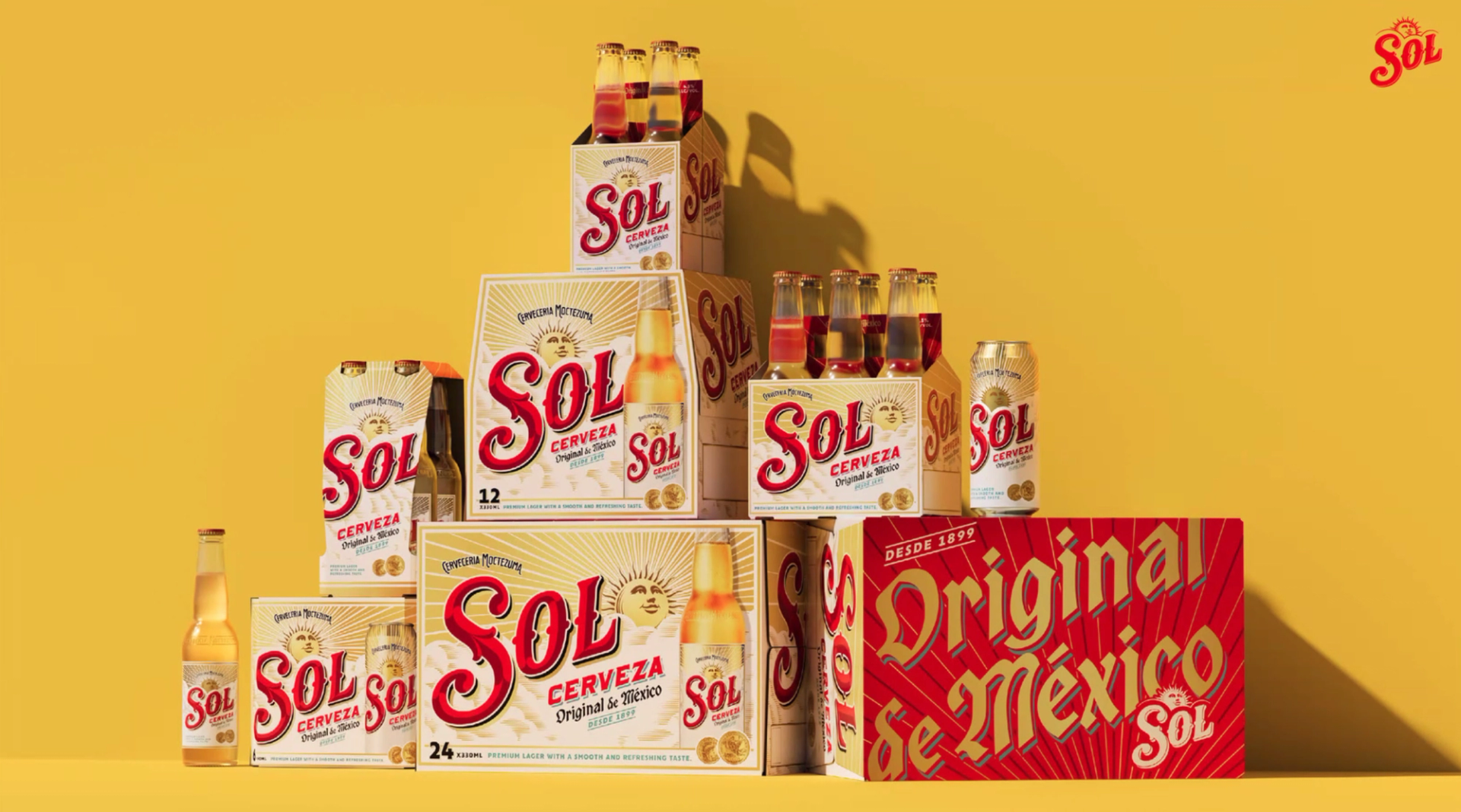
New branding for Sol Cerveza with illustrated elements by Tobias Hall
Manchester-based creative agency LOVE contacted us in May 2024, as they were embarking on a new global identity and packaging for the original Mexican lager, Sol. The redesign objective was to position the beer as the choice of young adult consumers and re-establish its status as ‘the original’ through craft and premiumisation. Using cultural insight, design and detail, they wanted the work to bring the brand’s heritage back to the fore, and attract a wider audience looking for quality and authenticity. They felt the brief was perfect for Tobias Hall, as did we.


Originally created in 1899, Sol was once a craft pioneer, championing its Mexican provenance and its sun namesake. The team at LOVE, asked Tobias to revisit that ethos and “dial up Sol’s heritage, presenting it in a fresh, modern and more premium way.” The refresh achieves that by reinforcing the brand belief that embracing positivity is the key to truly enjoying life. It positions Sol as a brand full of energy and vibrancy, appealing to young adults who embrace positivity and action.
The brief given to Tobias was heavily inspired by Sol’s extensive archive; we were shown a full history of the labels over the decades and faded signage from bygone campaigns. The new work looks to revive some of the authenticity that had been lost over the years.
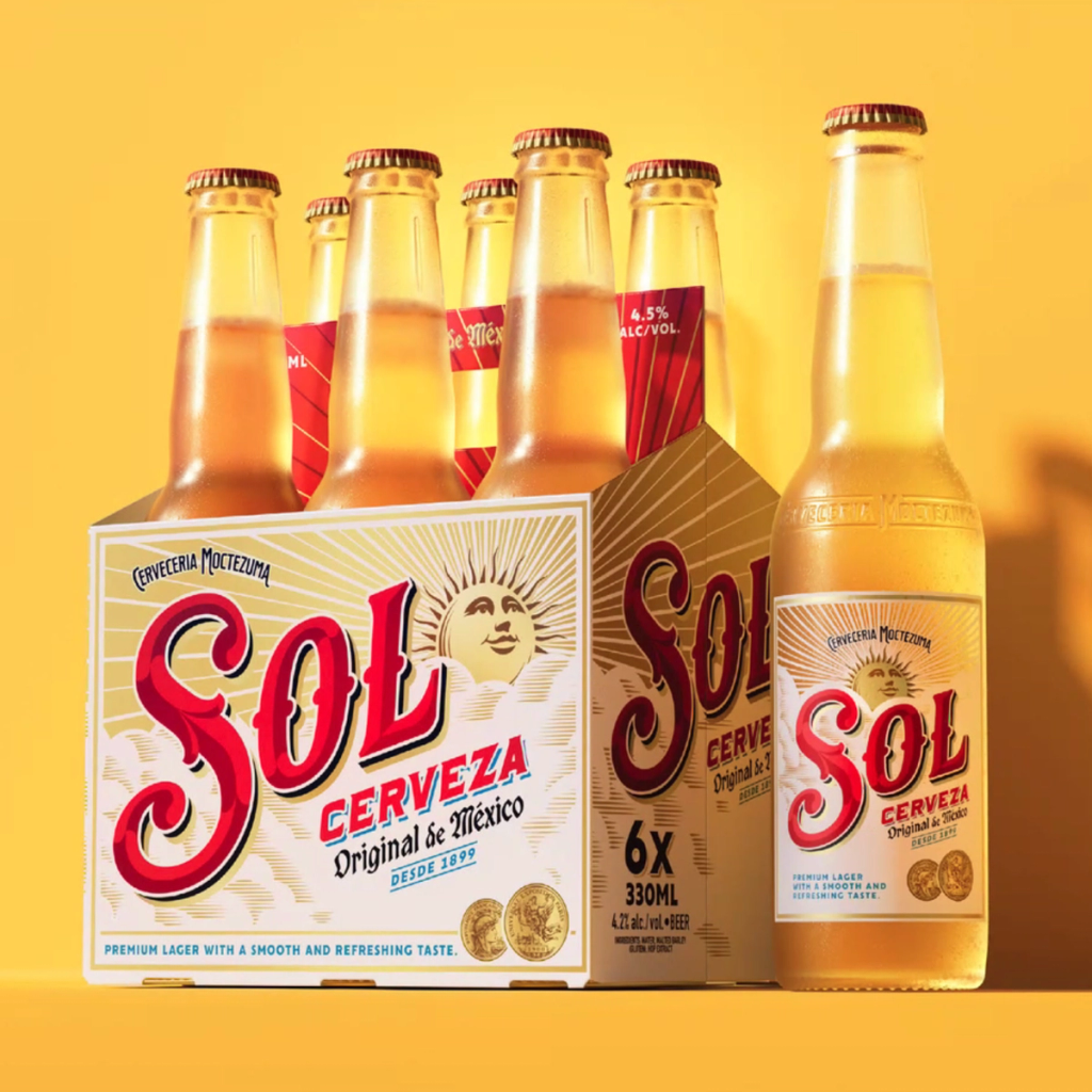
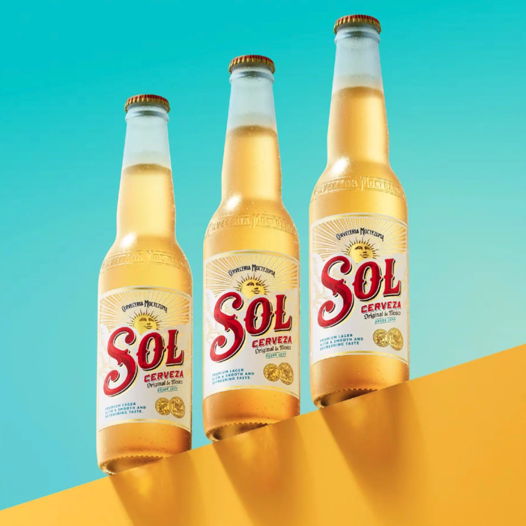
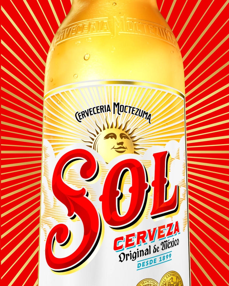
Tobias redrew all of the key design elements on the bottle label, from the Sol wordmark to the background clouds, secondary lettering and iconic sun face. For the new wordmark, Tobias was inspired by Sol’s historic labels breathing new life into the letterforms with his trademark painstakingly crafted details.
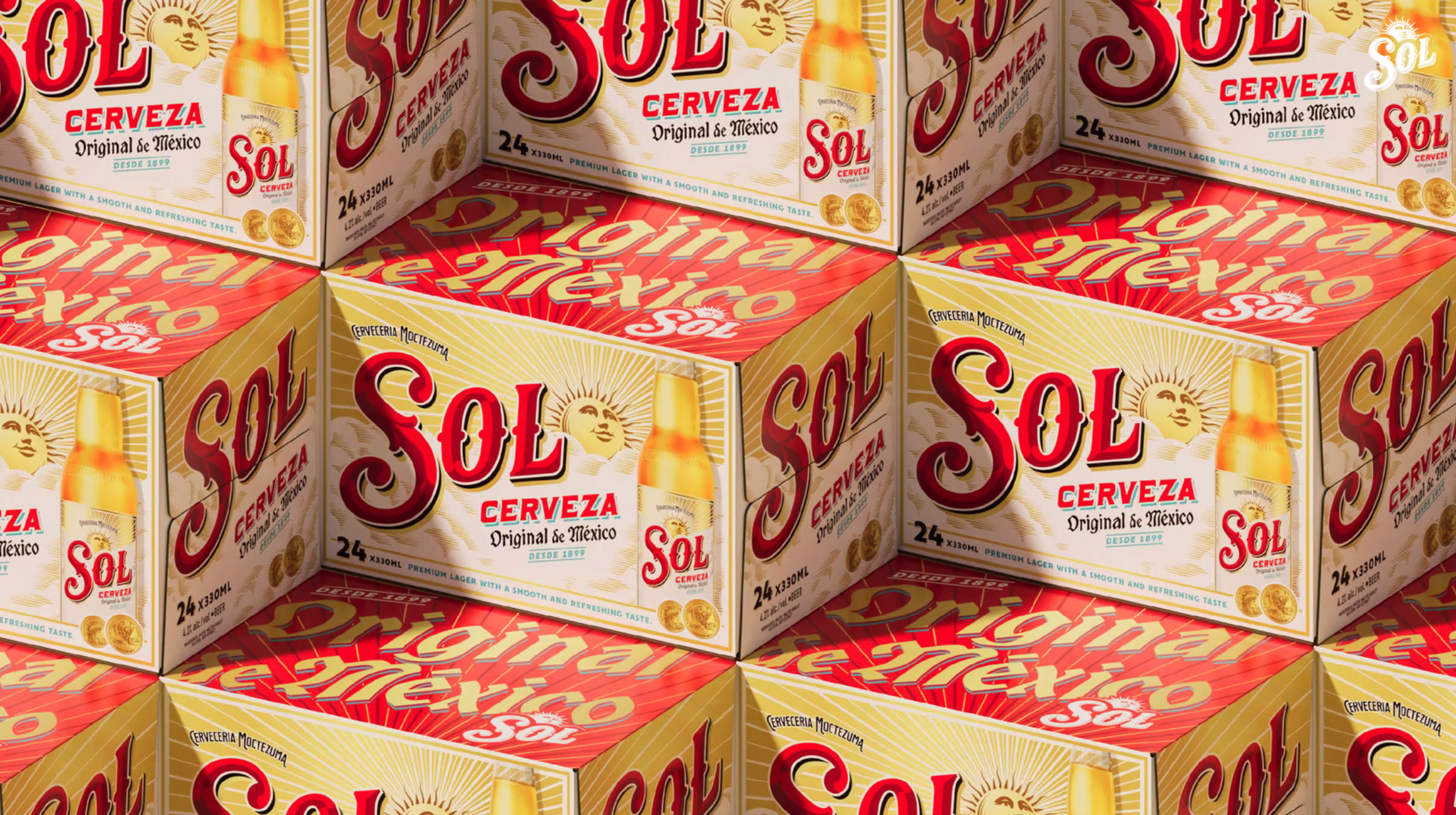

The central sun icon has also been redrawn by Tobias. Elevating is from its previous role as a functional background element. It’s now showing its full face for the first time, with an open, upward gaze (the artist's suggestion) looking toward a bright future.
A vibrant colour palette dials up Sol’s iconic red and gold, while introducing teal to represent a crisp, clear blue sky and the liquid’s freshness. Tobias’s bespoke supporting type reflects the brand’s origin story through a diverse mix of font styles reminiscent of ornate archive labels. The illustration of the Paris Exposition gold medal won by the brand in the early 1900s has also been fine tuned in a contemporary style to heighten its significance on pack.
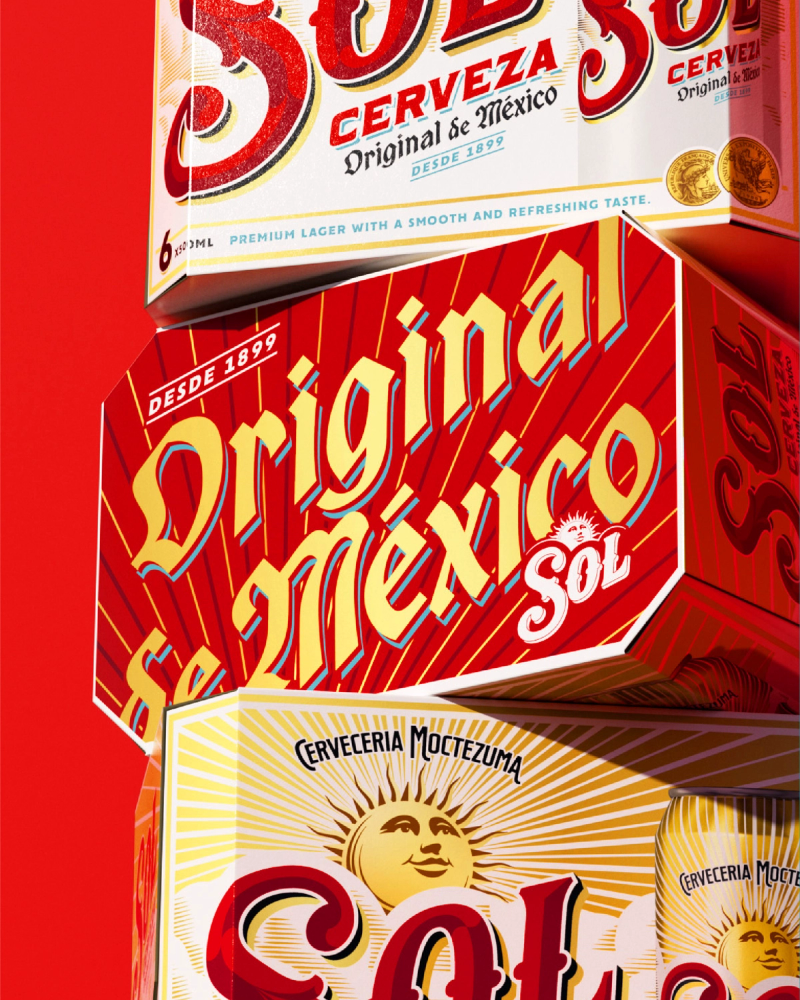
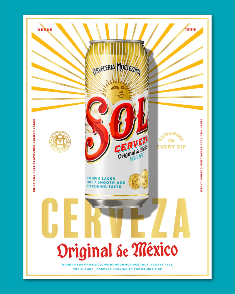
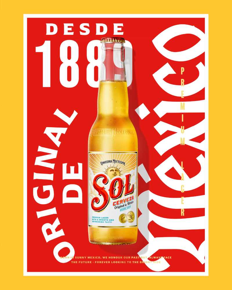


The redesign goes beyond packaging, creating a brand world that can evolve with changing consumer expectations. It positions Sol as a dynamic brand that young adults want to engage with.
The new identity will roll out globally across multiple platforms over the coming months ... ‘Welcome to the Sunny Side’.
Artist: Tobias Hall
Agency - LOVE. @lovecreative_mcr
Creative Director - Garry Calderwood
Design Director - Eve Warren
Design - Matt Buckley, Amber Cheyne
Creative Artwork - Sophie Knott
Senior Account Manager - Tegan Dixon
Account Director - Holly Bee
3D and Visualisation - Julia Möller, Matt Robertson
ECD - Chris Myers


